Capital campaign microsites are critical to any well-designed capital campaign marketing strategy. Here are five pages you should consider for your microsite.
Let’s start off by getting on the same page about what a microsite is exactly.
A microsite is an auxiliary website that has a different URL address than your primary website.
It has a temporary marketing purpose that requires a completely separate digital space. Because of its distinct purpose, microsite links and content will be much different from the primary website.
This doesn’t mean that microsites shouldn’t use brand colors, typography, and other design elements.
On the contrary, microsites should adhere to brand guidelines so that visitors know they are on a site created and operated by your education brand.
At the same time, though, a microsite needs to be different enough that your audience understands they’re not on your primary site.
Why Capital Campaigns Need Microsites
Capital campaigns are temporary initiatives with highly-focused outcomes in mind.
They have a strong, unique case, and they focus singularly on just a few of the most strategic needs of your college, university, or independent school.
A capital campaign microsite serves as your capital campaign marketing hub.
These campaigns also require an array of marketing efforts across multiple channels and over several years.
Due to the complexity of capital campaign marketing, you need a central hub from which your content is produced. Likewise, you need a consistent location to which you’ll send traffic.
That’s the fundamental reason why every education marketer needs to develop a microsite for their school capital campaign.
But what goes on a capital campaign microsite exactly?
After designing and developing multiple capital campaign microsites for private colleges, universities, and independent schools, we’ve found the following webpages to be among the essential pages of any capital campaign microsite.
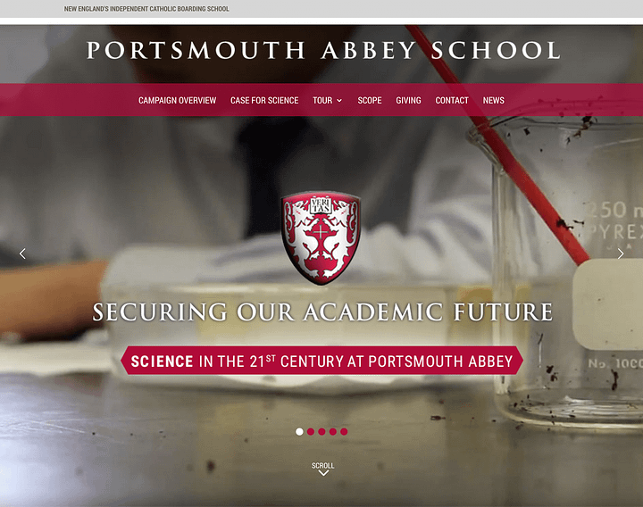
Homepage
It’s a given: There is no microsite without a homepage.
What’s not a given: A homepage that motivates your visitor to take the next step.
So make the most of this essential page to engage your visitor right away. Don’t design your microsite homepage the same way you’d design your primary website homepage.
The typical education website homepage is packed with links.
A bunch of them are on the visible page — but scores more hide in dropdown menus.
But a capital campaign homepage should be much simpler.
Your capital campaign microsite is all about one thing — convincing visitors to participate in the campaign, much like an enhanced landing page.
Your homepage is quite often (but not always) the page where your visitors land first. However, it’s not where you want them to stay or end their visit.
The objective of your capital campaign homepage is to use compelling copy and visual elements to:
Grab the visitor’s attention, and
Direct them to one of several next steps they can take towards donating, calling, or filling out a contact form.
Visitor Next Steps
Your visitor should have several possible actions they can take when they are on the homepage. Each step is designed to take your visitor further toward the ultimate call to action of your microsite.
Use the various sections of your homepage to tease visitors to explore each of your microsite’s pages. For example…
One section should entice visitors to navigate to your About page.
Another section should motivate visitors to check out the campaign’s progress and news.
Yet another section should introduce the various initiatives you’ve undertaken and invite visitors to discover more.
Your homepage should be an inspiring place where the visitor is invited to explore more of the possibilities they can be a part of.
Be sure to use a variety of content types like videos, parallel effects, headlines, images, and illustrated graphics to keep your homepage engaging for your audience.
About Page
At first, you might object to writing an About Page for your microsite. They’re overrated, overused, and boring, right?
So why do I think an About Page is a must?
Because your capital campaign About Page is where you should give your best arguments for participating in the campaign.
In other words, the About Page is the web version of your campaign’s case statement.
Don’t let this page get boring and confusing with all the facets of your campaign.
Go right to the heart and show your visitor why they should get involved. Include emotive elements like:
A visionary statement depicting what the future will look like after the campaign is successful
Emotional copy describing how the visitor will feel if they get involved
All of this should be done in a variety of formats — copy, video, and imagery — to strongly portray your case.
End your About Page with your microsite’s ultimate call for action: 1.) Contact/Call your development team or 2.) Donate.
Campaign Initiatives Page
Every capital campaign microsite should have an Initiatives Page where you get to spell out the various ways the campaign is going to bring change to your school.
Are you strengthening existing endowments? Creating new ones?
Are you building or renovating facilities on your campus?
Are you seeking to build a scholarship fund while you’re at it?
All of these initiatives should find their place here on this page.
In each initiative, write compelling copy that shows the visitor how their participation will move the needle forward. Present imagery or video content that introduces them to the students their donation will directly impact.
The biggest mistake you can make on this page is just giving the barebones facts about the initiative.
Tell the stories of students who are being changed by these initiatives and how much better it will be if the visitor gets involved.
Like the About Page, end the Initiatives Page with your call to action: 1.) Contact/Call your development team or 2.) Donate.
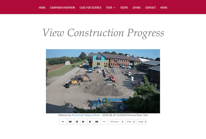
Progress Page
Personally, the Progress Page is one of my favorites because this is where you can really set your school apart!
Other schools may have a progress page where they bullet point their way through the information, like…
2/15/18 – Foundation laid.
3/10/18 – East Wing being framed in.
4/15/18 – Roof is completed, interior begins.
But this is where you can really make the “magic” feeling of physical progress come alive in your web visitor!
The simplest way is to post images and video frequently as buildings are constructed or rooms are remodeled.
If possible here, spice up your copy by sharing how the construction or remodel that was just completed would help students and further the mission.
But as a self-declared tech geek, I’m a big fan of live stream or live action cameras, like the one we set up for Portsmouth Abbey‘s Science Building capital campaign.
Webcams can produce live stream updates on your capital campaign’s progress.
News Page
Ah, the good old news page. So many capital campaign news sections are dry and lifeless — so do you really need this?
I think you do, but not like your competitors are doing it!
On your news page, you’ll want to publish news stories like:
Gift announcements
Donor stories
Student Stories
Video interviews
How the capital campaign is being covered in the media
Stories on why the campaign is necessary
Think of your news page more like a blog than a news ticker. Post new content that will excite and motivate your visitor to come back and see what new piece you’ve posted.
Giving Page
The giving page is a little like the homepage — you can’t have a capital campaign microsite without one.
The entire purpose of the microsite is to motivate your visitor to donate to the campaign, and the giving page is how they’ll be able to come through on this call to action.
Giving pages should be treated as you would any landing page.
Clear out all regular navigation, leaving only your brand logo at the top as a link to your microsite homepage.
This way, your visitor can only do two things on the page: Give through the donation form or navigate to your microsite homepage.
Create a clear, compelling headline at the top of the page. The best headlines correspond with whatever link they clicked on to get to the giving page. (The last thing you want here is for the visitor to think they landed on the wrong page!)
Under your headline, write a brief section of copy that summarizes what the purpose of the giving page is and quickly restates why the visitor should go through with giving today.
No more than one image should be used, and I recommend using a photo of a student because they’re the reason why donors give.
So there you have it…
My list of essential pages to any capital campaign microsite.
Of course, you might find the need to include another page, but I’d urge you to keep your microsite page count to a minimum.
If you crowd the site with too many pages, your visitors are more likely to get tired of the site and leave without performing the desired action.
Getting to Work
If you’re launching or reviving a capital campaign for your school, we’d be happy to put our expertise to work for you.
Set yourself free from your shrinking marketing budget with my popular ebook Marketing on a Shoestring Budget! This ebook is jammed with practical ways to produce high-quality marketing on the cheap.
Inside, I’ll show you proven marketing tactics like…
How to leverage low-cost technologies to reach your target market,
How to craft a content marketing strategy on a bare-bones budget,
The number one thing your website needs to do,
The key to getting free, organic traffic to your website, and more.
No hype. No pie in the sky. Just real solutions for getting the job done with the budget you’ve got.
Higher ed storytelling is most effective when leaders use authentic communication, video, AI, and mission clarity to connect with students and campus communities.