Flipping the Funnel: How Direct Admissions is Redefining Enrollment
Learn how direct admissions can simplify recruitment, boost yield, and help marketers connect with students earlier in the funnel.
Websites
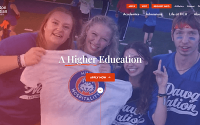
Your school’s enrollment website is one of the primary tools in your digital marketing toolkit. If you see any of these signs that your enrollment website is “broken,” it’s time for an overhaul!
It’s hard to stress just how important your school’s enrollment website is.
Websites are the digital front door, lobby, reception, and doorway into the rest of your school.
Whatever prospective students encounter on your enrollment website will either compel them to continue exploring or to click away as fast as they can. There is very little grey area here.
Because your school website MUST BE an enrollment website.
We’ll talk more about this in sign #10, but suffice it to say, you can do many things with your school website.
It could be a student portal. Your website could be an alumni development website. It could be a fundraising website focused on raising support for your school.
But high performing school websites are enrollment focused from start to finish. (Again, more on that in sign #10).
Despite how critical their websites are, so many schools never give their enrollment website a second glance after launching.
And hey, I get it.
Writing the copy, designing the layout, and the development process can be expensive, stressful, and time-consuming.
For many staff members, the last thing they want to do is review their website after (finally!) launching it.
But your enrollment website is too important to let go for too much time without a review.
The team and I put our heads together recently to write out a fun list of signs that your school website could be broken.
While the subject matter is serious, we offer this list with a smile and a friendly chuckle.
It’s all offered in good humor with the goal of arming you with the knowledge you need in order to decide if your enrollment website is broken or could perhaps use some tweaking.
So here are 10 funny signs your enrollment website might be broken…
It might drive your English department crazy – but web copy shouldn’t read anything like term papers!
Bad copy is dense with large paragraphs. Sentences are long, and might even sport a semicolon or two.
Good web copy means generally short paragraphs with paragraphs consisting of varying thickness to break up the monotony.
In general, sentences should be kept short and in the active voice rather than the cold third person passive voice.
Use commas sparingly. Semicolons almost never have a place in web copy.
Ellipsis points and EM dashes keep readers moving through the copy – they increase reading speed even while breaking up the sentence.
If you see dense, academic copy in your school’s enrollment website, it’s time to consider an overhaul.
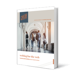
For more information on writing good web copy, download our free Writing for the Web eBook.
We live in a post-mobilegeddon world. That ship has sailed!
Search engines favor websites that are mobile-friendly.
It just makes sense. Take a look at this data from Perficient.com:
To begin, your enrollment website should be responsive to whatever size of screen it is being viewed by.
But response websites are just the beginning.
Being mobile-friendly also means that you view your own website on mobile devices when developing the site to see how you can improve the scrolling and mobile navigation experience.
By the time some enrollment websites fully load in the browser, the prospective student has already been distracted by five TikTok videos and scrolled through several other school websites.
This isn’t good!

Slow loading websites mean high bounce rates, the number of visitors who quickly navigate to other websites without reading through yours.
You want your school website to load quickly in order to capture your audience’s attention and answer their questions right away.
Here are some quick fixes for slow-loading sites:
This sign isn’t nearly as obvious as the others, but it’s just as important.
Your website may have all the right copy, images, and messaging – but you won’t know it without good analytics in the backend.
A blind website is a broken website.
Fortunately, there is a quick fix for this. By configuring traffic metrics like Google Analytics, you can get robust information on who is coming to your enrollment website, where they’re coming from, and more for free.
Simply create a Google Analytics account, set up your account, and embed the analytics code into the backend of your website.
Back when the first Internet sites were being born, Comic Sans was one of the few fonts available to web developers.
Internet browsers were still in their infancy and could only read a certain number of fonts.
Comic Sans quickly became one of the most popular fonts for its sense of fun and ease of reading.
But Comic Sans shouldn’t be used for serious publications like enrollment websites!
Sure, you want to show your prospective students that they’ll have a fun time studying at your private college, university, or independent school.
But as you can see clearly spelled out at comicsanscriminal.com, Comic Sans is only fun for those under 11 years old.
Anyone older than 11 doesn’t think of Comic Sans as fun. They think of it as patronizing.
The lesson here?
Only use appropriate fonts in your website so that your copy and the font both speak the same messaging to your prospective student.
Better yet, hire a professional designer to create a palette of fonts, colors, and other graphic elements for your enrollment website.
Okay, so this isn’t a slam on mullets. In fact, I’m seeing in some of my son’s friends that mullets and 80’s fashion is making a comeback.
So you might be “all business in the front and party in the back” – and we accept you as you are!

The point here really is that you should be updating the imagery on your website as often as possible.
Images can easily become dated, making your school look behind the times.
If your imagery shows that you’re stuck in the past, who’s to say your academic programs aren’t just as stuck?
I know that’s not a fair assumption, but perception is everything.
So keep your images fresh and updated!
This is an easy trap to fall into. Faculty are an important piece of what you have to offer your prospective students.
However, when your website features more faculty success stories than student success stories, it begins to look like your school exists more for the benefit of your faculty than for students.
Again, that might not be a fair assumption, but perception is what counts.
Prospective students should feel from your copy, design, and imagery that your school is the absolute best choice for them and their careers.
Following the theme of faculty issues brings us to faculty pictures.
Featuring faculty pictures on your enrollment website is a good idea.
However, allowing faculty to choose the pictures they want to post on your website isn’t always a good idea.
Too often, faculty will send whatever photo they like from their mobile camera rolls rather than a well-done professional picture.
As a result, you’ll have faculty pictures showing outdoor cookouts in the background or faculty members in their car taking a selfie.
Needless to say, this isn’t a good look for your school!
That’s why we recommend that the marketing team or HR schedules photo shoots for faculty members to create the required photos for the website.
One important feature of any enrollment website is the ability for visitors to fill out forms.
From subscribing to email newsletters to signing up for a campus visit to starting their application process, visitors can do it all through a form on your website.
But if it takes a visitor more than 5 minutes to fill out and submit your forms, you’re likely to see a dip in your conversion rates.
One of the simplest ways to make form submissions quick and painless is to limit asking for information that is unnecessary at that time in the enrollment cycle.
If your prospective student is signing up for your email newsletter, do they really have to give you their phone number?
If they’re filling out a campus day visit form, do they really need to give you their postal address?
Think it through and streamline your forms.
What is the minimum amount of information you need at this point in the relationship to move them to the next stage in the relationship?
Private colleges, universities, and independent schools have a lot going on. So much so it’s difficult to decide what needs to go on the home page and what can be deeper in the site.
Departments can often get into debates over the real estate on the home page.
The advancement team will want their call to give front and center. Alumni will want alumni to RSVP for the upcoming homecoming event.
And they all will want their elements on the home page.
Enrollment.
Every school website should emphasize the content marketing needs of the enrollment team – even at the expense of other teams, as necessary as they are.
This makes sense if you think of the student lifecycle.
Enrollment is the source for all your other departments.
Current students come from the efforts of the enrollment team. Alumni come from new students who were brought in through enrollment. Donors come from alumni who came in through enrollment.
Therefore, successful school websites always emphasize the digital marketing needs of the enrollment team.
A laser-focused enrollment website keeps all other departments full of new prospects.
It might be time to redesign your enrollment website so that you get the results you’re looking for.
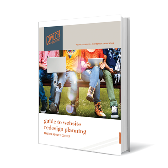
Download our free Guide to Website Redesign Planning to learn more about how to fix the most common problems school websites have.
 In this guide, you’ll explore how to…
Don’t revamp your website before you check out our free Guide to Website Redesign Planning!
And if you want to go deeper to see how much more you can get out of your enrollment website, contact us for a consultation and a digital marketing audit.
Featured image by kues1 via Adobe Stock
Loading image by jesadaphorn via Adobe Stock
Man with Mullet image by Peter Kim via Adobe Stock


Subscribe to The Higher Ed Marketer podcast today!
Learn how direct admissions can simplify recruitment, boost yield, and help marketers connect with students earlier in the funnel.

Discover how AI video content creation in higher education boosts engagement, scalability, and student trust—without losing your authentic voice.

How UVM is innovating enrollment with affordability, leadership, and retention strategies that align mission with measurable impact.