Mission Clarity in Higher Education: The Leadership Advantage
See how mission clarity in higher education helps Christian colleges strengthen leadership, enrollment, storytelling, and student trust.
Marketing Strategies
If you’re serious about boosting enrollment, it’s time to turn your college website into a lead generation tool. It shouldn’t just look good.
It should work hard.
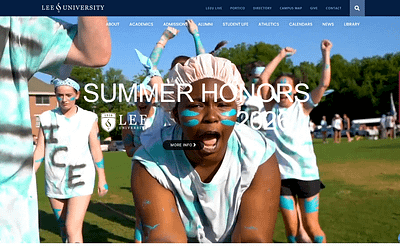
If your school’s site is still functioning like a digital brochure—a place to park announcements, profiles, and outdated PDFs—you’re leaving enrollments on the table.
Today, your website is your most powerful tool for attracting and engaging the right students.
It’s your front door, your best recruiter, and your hardest-working team member—if it’s built the right way.
And yet, too many college and university websites are still driven by internal politics, academic silos, and a copy-paste approach from the course catalog.
They prioritize information over inspiration. Design over direction. Committees over conversion.
If that sounds familiar, you’re not alone. But the good news is, you don’t need a total website overhaul to start seeing better results.
What you need is a strategic shift. From passive information hub to active enrollment platform.
In this post, you’ll learn how to turn your college website into a lead generation tool—one that attracts, qualifies, and converts mission-fit students.
Let’s get to work.
Before you can turn your college website into a lead generation tool, you need to get clear on who you’re trying to reach.
It’s not about getting more applications—it’s about getting the right ones.
Mission-fit students are those who are more likely to thrive on your campus, align with your values, and stick around through graduation.
They’re not just looking for a degree—they’re looking for a place to belong.
And that means your website has to do more than inform.
It has to resonate.
In Chasing Mission Fit, we define a mission-fit student as someone who aligns with your institution’s identity, not just its offerings.
They’re drawn to your story, your community, your outcomes—not just your programs.
When your site is built with this mindset, it becomes more than a digital billboard.
It becomes a filter.
A well-designed, mission-driven website helps the right students say, “Yes, this feels like home,” and helps others realize, “Maybe this isn’t the place for me.”
And that’s a good thing.
Filtering out poor-fit leads is just as important as attracting the right ones.

Because when your funnel is full of students who actually belong, your yield rates go up, your retention improves, and your marketing dollars go further.
That’s the power of alignment.
Once you’ve got the mission-fit marketing mindset driving the project, you can then turn your college website into a lead generation tool by hitting these three main objectives.
The first job your site must do is communicate clearly and quickly that your school is a place where the right students can see themselves thriving.
That starts on the homepage.
In the first few seconds, your site should help prospective students answer three critical questions:
If your homepage doesn’t make those answers obvious, you’re losing potential leads before they ever click past the hero banner.
Forget about showcasing every academic office, committee, or campus initiative on the homepage.
Students are looking for outcomes, belonging, and affordability.
They’re not looking for your board meeting minutes or a 47-page strategic plan.
One of the simplest and most effective frameworks we use at Caylor Solutions is what I call the 5a + 2c + x navigation formula. It’s a clear, intuitive way to organize your website that centers the prospective student’s experience.

Start with the five A’s: Admissions, About, Academics, Athletics, and Advancement. These are the core sections every prospective student (and their influencers) expect to find quickly.
Then add the two C’s: Community and Contact. These help students envision what life on your campus is like and give them an immediate way to connect with your team.
Finally, include one wildcard “X” section that reflects your brand’s unique identity—whether it’s Faith, Blog, Campus Life, or something else.
This approach limits your primary navigation to seven to nine key links, making it easy for users to find what they need without getting lost in a sea of options.
This formula has been a very successful way to cover the needs of most colleges and universities, but your mission-fit students may have additional concerns that are unique to them.
So make sure your homepage answers the real questions students are asking, even if they go beyond what I’m suggesting here.
If you answer their questions, you’ll not only make a good impression.
You’ll lay the foundation for a website that drives enrollment—and helps mission-fit students take the next step.
Once you’ve nailed your homepage and navigation, it’s time to turn your attention to content.
Because let’s be honest—no one returns to a website just to admire the layout.
They come back because the content speaks to them.
In order to turn your college website into a lead generation tool, your content has to move beyond generic updates and event recaps.
It needs to be useful, emotional, and relevant.
That’s what makes content feel fresh.
Not frequency, but value.
Students are searching online with questions like, “Can I really afford this degree?” or “What can I do with a major in digital marketing?”
This is where Jay Baer’s concept of “useful marketing” comes in—giving answers before your audience even thinks to ask the question.
Publishing helpful blog posts, video testimonials, career outcome guides, and how-to resources builds trust and keeps visitors engaged.
It also gives them something to share with parents, mentors, and friends—amplifying your reach organically.
And don’t forget the emotional side.
Highlight student stories, transformation journeys, and outcomes that matter.
That kind of content doesn’t just inform.
It inspires.
And when your content is both helpful and human, it becomes a powerful connection point between your mission-fit students and your institution.
It keeps them coming back—and nudges them closer to taking the next step.
The third step in turning your college website into a lead generation tool is making sure visitors know exactly what to do next.
This is where conversion comes into play.
Every page on your website should include a clear call to action—something specific that guides the visitor toward the next step in their journey.
For prospective students, that might mean scheduling a campus visit, downloading a program guide, requesting financial aid info, or starting an application.
Don’t make them dig for the button. Put it right where they’re already engaged.
Use buttons, banners, and in-line links that stand out and speak directly to their needs.
The best CTAs are short, clear, and action-oriented.
Avoid vague labels like “Learn More” that don’t communicate what’s behind the click.
Even better—pair your CTAs with lead magnets.
A lead magnet is any piece of valuable content that students are willing to exchange their contact info for.
That could be a checklist, an eBook, a scholarship guide, or an on-demand webinar.

Just make sure your forms are short.
You don’t need to know their dog’s name or favorite cereal.
Start with first name, last name, and email—maybe one or two qualifying questions, max.
Friction kills conversions. Make answering the call to action as fast and easy as possible for your user.
Don’t let that contact form lead to a dead end. Route the lead into your CRM.
Send a personalized follow-up email. Invite them to take the next step.
A call to action without a follow-up is a missed opportunity to create a relationship.
You can have the best design and content in the world, but if your site doesn’t load quickly or work on mobile, you’re losing leads.
To truly turn your college website into a lead generation tool, you need to eliminate the technical friction that pushes visitors away.
Start with speed.
Page load time is a huge factor for Gen Z students who expect instant results.
If your homepage takes more than three seconds to load, a significant portion of your traffic is bouncing before they even see your message.

More than half of all traffic is coming from mobile devices, and for many prospective students, their phones are their primary screen.
Menus should collapse neatly.
Buttons should be easy to tap.
Text should be legible without pinching and zooming.
Every form, every page, and every feature must be mobile-friendly.
But don’t stop at design!
Set up Google Analytics to monitor traffic patterns.
Use form tracking or landing page tools to see which calls to action are actually converting.
Data tells the story.
And the better you understand your audience’s behavior, the better you can refine your site to meet their needs.
Technology is often the silent partner in effective lead generation.
But when it’s working well, it makes everything else—your message, your content, your CTAs—that much more effective.
You don’t need a glossier design. You need a website that delivers results.
When you turn your college website into a lead generation tool, you shift from passively sharing information to actively guiding mission-fit students toward enrollment.
And that changes everything.
It changes how you approach homepage content.
It changes how you write copy, build menus, and design calls to action.
It changes how you define success.
Pretty websites might win design awards, but enrollment-focused websites win over the students who matter most.
You don’t have to start from scratch.
You just have to reframe your strategy.
Focus on students. Streamline your message. Track what matters.
Need to Turn Your College Website into a Lead Generation Tool?
At Caylor Solutions, we don’t just build pretty websites—we build enrollment machines.
Our Website Design & Development services are tailored specifically for colleges and universities that want their site to work—to attract, qualify, and convert mission-fit students.
From structure and storytelling to mobile responsiveness and lead generation strategy, we design with one goal in mind: helping your institution grow.
And once your site is live, we don’t leave you hanging.
You’ll get ongoing theme, plugin, and CMS updates, plus expert help on making changes to your site without disrupting the experience of your users.
Got questions or need help with content updates?
With a monthly maintenance contract, our support desk is just a click away.
So if you’re tired of mediocre results, let’s turn your site into a lead generation machine!
We’re ready when you are. Let’s talk.
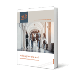
It might be time to redesign your enrollment website to get the results you’re looking for.
Download our free Guide to Website Redesign Planning to learn more about how to fix the most common problems school websites have.
 In this guide, you’ll explore how to…
Don’t revamp your website before you check out our free Guide to Website Redesign Planning!
And if you want to go deeper to see how much more you can get out of your enrollment website, contact us for a consultation and a digital marketing audit.
Images via Midjourney


Subscribe to The Higher Ed Marketer podcast today!
See how mission clarity in higher education helps Christian colleges strengthen leadership, enrollment, storytelling, and student trust.

Build a higher ed content marketing strategy that grows enrollment through clear, consistent storytelling.
Discover how authentic higher education branding, alumni stories, and clear differentiation can build trust and strengthen enrollment marketing.