
Hispanic Student Recruitment Strategies: How to Increase Enrollment & Engagement
Discover proven Hispanic student recruitment strategies that boost enrollment, from bilingual marketing to community engagement.
Websites
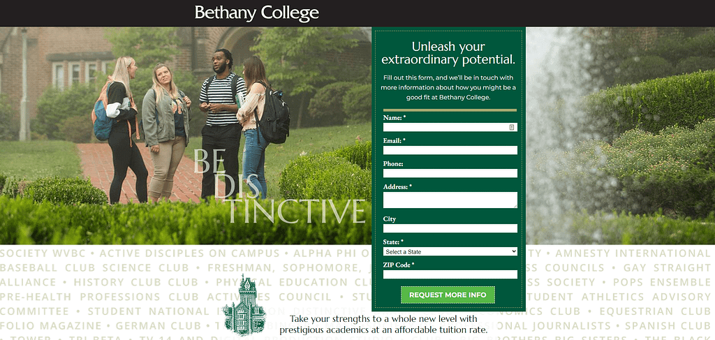
At the core of every higher ed institution’s mission (and fiscal viability) is a strong enrollment focus. That’s why optimizing for conversion on your enrollment-focused website is so important.
Getting your target audience to the site is one thing (through techniques like search engine marketing/SEO), but then you’ve got to convince them to take action.
Unlike much of SEO, which involves publishing content in a search engine-friendly way, this is all about writing and designing for humans.
This is especially true of your enrollment-focused landing pages. But other high-level pages on your school’s site should follow similar guidelines as well.
As I’ve written about before, your school is not just an institution. It’s also an education brand with a unique selling proposition, just like any other business.
Emphasis on unique.
There is so much you can say about your school. A lot of it has value but isn’t especially unique.
What sets you apart from the competition? When your primary audience is a prospective student overwhelmed by their options, you have to be able to answer that question succinctly.
Communicate the benefits you believe your school delivers better than anyone else.
Those benefits should speak directly to what students want:
Your enrollment-focused pages should tap directly into these motivators. They should tie your unique proposition to these specific desires.
Is your USP about how you put a higher value on helping students find meaning in life than other schools?
Do you excel at connecting graduates with high-paying jobs?
Or, does your school have more opportunities for cultural exchange than the competition?
Whatever unique benefit a student can expect to experience at your school, put your eggs in that basket on your enrollment-focused pages.
The general rule of thumb when optimizing pages for enrollment conversion (e.g. request info, visit, apply) is to write as much as you need to, and no more.
Sorry, there’s no perfect formula here. No magic word count.
Just keep in mind the audience you’re writing for.
Unlike prospective donors – preparing to make a very different kind of investment, motivated by different factors, and may want more written details – students need you to get to the point.
Empathize with your prospects. They may be looking at a dozen schools, weighing how drawn they feel to each, how much affinity they sense with you compared to others.
The copy should be emotive, not overly informative.
Use headers, subheaders, taglines, and brief blocks of copy to get the USP across.
Don’t give them the same long blocks of text that they’ll find in the student handbook, or in a syllabus, or a financial aid packet.
Again, identify the motivator. Communicate the unique benefit. It’s the only way to stimulate enrollment action for today’s prospect who is overwhelmed with digital information.
An enrollment-focused web page is not primarily a source of information.
Now, read that last sentence again.
These are pages designed to persuade, not inform. They either remind students of what they already know or provide links to pages that do provide in-depth information.
But don’t go overboard with linking out to other pages, either. Providing too many places to go can be overwhelming, too.
On your true landing pages, that action should be filling out a form that provides you with information about your prospect: Request Info, Visit, or beginning the Apply process.
But even high-level pages like Home, Admissions, and Academics should subtly lead your prospect toward those actions.
You might link out to a page to explore student life, for example, with some copy that suggests they plan a visit. That next page should have an attractive Visit button.
Wherever you drive them – programs, financial aid info, etc. – think of it as the next stop on their virtual tour. Each stop is persuasive, emotive, not overly informative.
Whatever path they take, your prospect’s journey should flow naturally as you gently push toward the final stop: a landing page with an irresistible form.
It may seem obvious to you what the prospect is supposed to do on, say, an Apply page.
But assume nothing.
Keep the design simple so it’s abundantly clear to your prospect:
And if applicable, you may also need to clearly specify the Who – undergrad and adult/graduate buttons/forms in separate sections of the page.
I tend to recommend separate pages for different types of applicants to make it as clear as possible to the applicant that they’re in the right place.
On a lead-generating landing page, such as a Request Info page, lead with a simple form with as few fields to fill out as possible.
The three essential components are:
The most common mistake I see with higher ed web pages is when they try to do too much.
Your goal for these pages is not to provide all the information your prospect could possibly want. That’s just not feasible or helpful.
Your goal is to stimulate action.
To support that goal:
This simple approach is what your busy, possibly stressed-out prospective student – who maybe just clicked on an ad in a fleeting moment of curiosity – needs right now.
If you need help optimizing your enrollment-focused website to drive prospects to action, contact us today.
You’re in luck! We’ve curated 25 awesome ideas inspired by top higher ed institutions across the country and put them in one handy guide: 25 Ideas for Great Admissions Content.
 In this popular resource from Caylor Solutions, you’ll get…
Get inspired.
Get enrollment results.
Get 25 Ideas for Great Admissions Content.
Download your copy today!
Featured image by Peampath via Adobe Stock


Subscribe to The Higher Ed Marketer podcast today!
Discover proven Hispanic student recruitment strategies that boost enrollment, from bilingual marketing to community engagement.

Higher ed branding strategy for crowded markets. Learn how to stand out and attract mission-fit students for your school.

Discover why marketing dual enrollment programs boosts enrollment, attracts mission-fit students, and delivers outstanding academic results.